Data visualization presents the information and data in visualized patterns which could help people to gain insights effectively. Data visualization tool utilizes visual elements like graphs and charts to make data speak. There are many data visualization tools on the market, but which one should you choose? Here is a list of the top 33 data visualization tools including their pros and cons. You can then decide which one would fit your needs.
We divide them into two categories: tools that require no programming and tools for developers only. Under each category, data visualization tools are assorted into sub-groups based on specialization. Some tools like Tableau have a wide range of graphs and charts; Some tools like Infogram are well-known in making infographics. Some tools start gaining popularity because of interactive charts like Gephi.
Best Data Scraping Tool (No Coding)
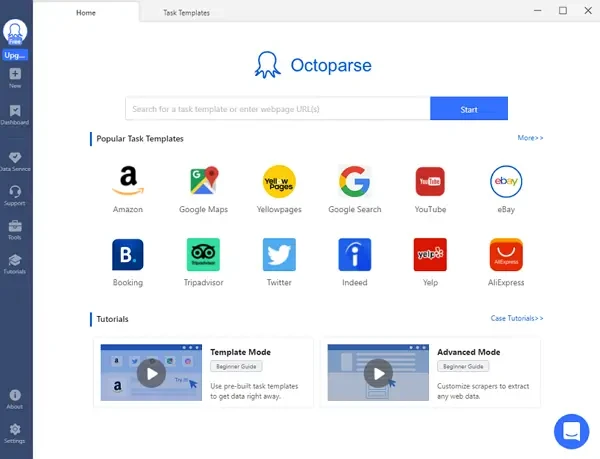
At the very beginning, we want to introduce an easy-to-use web scraping tool to help you collect data from any website. Octoparse, a no-coding web scraping tool, both experienced and inexperienced users can use it bulk extract information from websites with no coding skills needed. Octoparse makes it easier and faster to get data from the web. It will automatically extract content from almost any website and allows you to save it as clean structured data in a format of your choice. You can also turn any data into custom APIs. Now you don’t have to hire tons of interns to copy and paste manually. You just need to make the rule for collecting data and Octoparse will do the rest.
Data Tools for Non-tech Professionals
Charts and graph visualization tools
Some data visualization tools provide different paid plans for individuals, small teams, and organizations. These tools have more features and technical support than free ones.
1. Chat4Data
Chat4Data is an AI-powered Chrome extension designed to be your ultimate data collection assistant. With intuitive natural language commands or simple quick-click actions, you can effortlessly extract and organize web page data on any website, making information gathering faster and smarter than ever.
2. Octoparse AI
Octoparse AI allows anyone to build software robots and AI agents that automate the busywork. No coding required. This advanced automation platform enables users to create intelligent workflows for data collection, processing, and analysis, making it perfect for businesses looking to streamline their data operations with AI-powered automation.
3. RAWGraphs – Free
RAWGraphs is an open-source web tool and a data visualization framework. It aims at providing a missing link between spreadsheet applications(e.g. Microsoft Excel and Apple Numbers) and vector graphics editors (e.g. Adobe Illustrator and Sketch). You can just insert your data into RAWGraphs and customize your charts and export them as vector (SVG) or raster (PNG) images. Moreover, data uploaded to RAW will be processed only by the web browser, guaranteeing data safety.
4. ChartBlocks – Free
ChartBlocks is a simple online chart-building tool, and its data import wizard can lead you step-by-step to show you how to import data and design charts. Unlike RAWGraphs, you can easily share your charts on social media. You can also export charts as editable vector graphics or embed charts into websites with a free personal account. Professional accounts and elite accounts are also offered.
5. Tableau – For individuals or business
Tableau is the most famous data visualization tool all over the world, letting people transform data into effective visualization (charts, graphs, and even maps). Tableau is a very powerful, secure, and flexible analysis platform, and you can just drag the data into Tableau and graph it with your colleagues. You can also visualize reports generated via desktop, browser, mobile, or embedded into any application.
6. Power BI – For individuals or business
Power BI is a suite of business analytics tools developed by Microsoft and thus integrated well with Microsoft Office. Users can import any data such as files, folders, and databases and view data anywhere using the software, online web editor, and mobile apps. Power BI is free for individual users and it only charges $9.9 for each user in the team per month. Anyone in the team can analyze data and make decisions at any time.
7. QlikView – For individuals or business
QlikView tool is a business intelligence tool mainly focusing on business users in organizations, and users can easily analyze their data and use the analytics and enterprise reporting capabilities of QlikView to support decision making. QlikView also provides a personal edition so that individual users can enjoy its powerful features of it. You can simply type in the keywords you want to search within the dataset, and QlikView can help you find unexpected information and data associations.
8. Softr.io – For individuals or businesses
Softr is a no-code platform that connects with Airtable, SLQ datasources, HubSpot and other data sources allowing you to build charts and dashboards with your data. You can use Softr’s Chart blocks to visualize your data and share it with your team. Users can update the data with CRUD functionality, import files and collaborate with each other.
You can filter your data and create personalized dashboards directly within your Softr app using features like Aggregation, Max categories & sorting, Segment by and Empty value handling. Softr’s Chart functionality is available for Professional plan users only with 139$ billed monthly.
9. FineReport – For individuals or business
FineReport is reporting and dashboard software with stunning visualization effects. It provides impressive self-developed HTML5 charts that can be smoothly displayed on any website or webpage, with cool 3D and dynamic effects. The visualization adapts to any screen size, from TVs and large screens to mobile devices. Easy drag-and-drop operations achieve all effects.
What’s more, the amazing thing I happened to find out is that FineReport is FREE for individual users.
10. Datawrapper – For individuals or business
Datawrapper is an easy-to-use online tool to create fully responsive charts or maps aimed at journalists and other content creators. With Datawrapper, journalists can make rich charts to attract the readers’ attention and better illustrate their content. Moreover, it is created by a team including journalists, and hence they offer many fun articles telling you how to create better charts and stories behind these charts in their blog.
11. Visme – For individuals or business
Visme provides a huge amount of photos, icons, templates, and fonts for users to make presentations, graphics, charts, and reports. Social media (e.g. Instagram, LinkedIn, YouTube) graphics could be created within 3 steps with dynamic images and real-time data. With Visme, you can view and present your content anytime from anywhere on any device. Besides, Visme provides education discounts and non-profits discounts.
12. Grow – For enterprise only
Grow is a business intelligence tool for business users only. With Grow, everyone in the company can track meaningful data and create their own specific dashboards to make informed decisions, supporting over 150 integrations. Grow claims they can implement 8x faster than competitors with a seamless process, and over 300 pre-built reports and real-time data updates are also supported for business purposes.
Data visualization infographic tools
It is very easy and convenient to create infographics with visualization tools, and you can even create your own social network infographics with several clicks.
13. Infogram
Infogram let you create infographics, charts, and maps with many free templates, and you can either download them or embed them into websites. All these processes could be done in the web browser with ease. Infogram is very powerful and popular, and users have created charts, reports, and infographics viewed over 1.5 billion times. Except for the free basic plan, it also offers the professional plan, business plan, and such.
14. Visual.ly
With Visual.ly, you can easily create infographics, videos, reports, and ebooks for your marketing campaigns. There are plenty of inspiring and informative infographics uploaded by users on Visual.ly, and you can have your own social network infographics automatically generated through Visual.ly, which is very popular among those active social network users.
Map data visualization tools
Analysts can make Software as a Service (SaaS) to generate geographic reports without writing any code.
15. InstantAtlas
InstantAtlas is a SaaS delivering visual reports with professional support services. It enables information analysts and researchers to create interactive dynamic map reports that combine statistical and map data to optimize data visualization.
Network graphs tools
When visualizing social network graphs, special data visualization tool should be chosen for generating complicated nodes and leaves.
16. Gephi
Gephi is the leading open-source visualization and exploration software for all kinds of graphs and networks. Gephi processes relational data. For example, in social media such as Twitter, who follows whom; in the election, who voted for whom; in an organization, who has a cooperative relationship with whom.
Mathematical graphs tools
Mathematical graphs are widely used in education, and everyone can easily generate these graphs online.
17. Wolfram|Alpha
Wolfram|Alpha is known as a computational knowledge engine – doing dynamic computations and returning the relevant visual graph. Wolfram|Alpha is based on Mathematica, and the underlying operations and data processing are done by Mathematica running in the background. Mathematica supports geometric, numerical, and symbolic calculations, and has powerful graphical visualizations of scientific and mathematical graphics. Therefore, Wolfram|Alpha can answer a wide variety of mathematical problems and present the answers to the user in clear and beautiful graphs. You can also upgrade to Wolfram|Alpha Pro and upload your data and images for analysis.
Data Visualization Tools for Developers
Developers integrate data and turn these data into beautiful and complicated charts and graphs using charting libraries. There are hundreds of charting libraries available online, and most of them are implemented in JavaScript for web and mobile device display.
Charts and graphs tools
18. ECharts – Free
ECharts, originally short for “Enterprise Charts”, is an open-source visualization library implemented in JavaScript. Many innovative features like recomputing data through drag-and-drop, data view, value domain roaming, and others greatly enhance the user experience, giving users the ability to mine and integrate data.
19. D3.js – Free
D3.js is an open-source JavaScript library for manipulating documents based on data, using HTML, CSS, and SVG, and is regarded as the leading JavaScript visualization framework. Getting started learning D3.js is complicated, but D3.js is powerful, flexible, and worth learning deeply. Remember that D3.js cannot display graphs in lower versions of the IE browser.
20. Plot.ly – Free
Plotly is a well-known and powerful data visualization framework that displays information by building interactive graphs based on web browsers, creating dozens of beautiful charts and maps. It offers some charts you cannot find in most packages, like contour plots, candlestick charts, and 3D charts. Plotly’s team maintains the fastest-growing open-source visualization libraries for R, Python, and JavaScript. They also provide modern rich analytics apps in Python for the Enterprise.
21. Chart.js – Free
Chart.js is an open-source JavaScript charting library for designers and developers, providing 8 customizable dynamic visualizations for your data. The most distinctive quality of chart.js is that it can draw great responsive charts using HTML5 Canvas. Chart.js allows you to mix different chart types together and then plot date, logarithm, or custom scale data on it. You can also apply out-of-frame animation when changing data or updating colors.
22. Google Charts – Free
Google also develop its JavaScript charting library. Google itself uses the same chart tools, and provides it to developers for completely free with three years’ backward compatibility guaranteed. With simple JavaScript embedded on your web page, you can choose from a variety of chart templates and customize them to create your own interactive charts.
23. Ember Charts – Free
Ember Charts is an open-source charting library built with the Ember.js and d3.js frameworks, and it is very easy to extend. Ember Charts mainly draws a time series diagram, histograms, pie charts, and scatter plots. Together with the Ember.js development team, Ember Charts focuses on graphical interactivity. It has a very strong error handling capability, and the system won’t crash when you encounter bad data.
24. Chartist.js – Free
Chartist.js is the product of a community that was disappointed about the abilities provided by other charting libraries. Chartist.js is an open-source, simple to use, and you can use it to create highly customizable responsive charts. It is fully responsive and very flexible with a clear separation of concerns.
Commercial tools for developer
If you want to display plenty of complicated charts for business purposes with technical support, you might want to purchase licenses from powerful charting libraries.
25. Highcharts
Highcharts is an open-source charting library written in JavaScript that makes it easy to add interactive charts to websites or web applications and is available for free for personal learning, personal websites, and non-commercial use. What’s more, Highcharts is more compatible than D3.js and can be used on all mobile devices and browsers on your computer, using SVG in modern browsers and VML in lower versions of IE browser for graphics drawing. If you want to run Highcharts on a commercial or governmental website, intranet, or project, you need to purchase licenses along with premium support.
26. FusionCharts
FusionCharts provides charged services with a powerful JavaScript charting library and direct technical support. FusionCharts can reduce the burden on developers by generating splendid charts and maps through interactive data visualizations, and its integrations are also available for all popular tech stacks.
27. ZingChart
ZingChart is a paid charting library implemented in JavaScript mainly for SaaS and Enterprise. It provides big data charts that can render 100,000 data points in under 1 second. Responsive and interactive charts that scale to any device size are also supported. An individual user can use the free version of ZingChart while the watermark must be visible on all charts at all times.
Maps tools for developers
When developers want to show interactive maps on websites, map libraries in JavaScript are essential.
28. Leaflet
The leaflet is the leading open-source JavaScript library for mobile-friendly interactive maps. Although Leaflet is simple in design and easy to use, it is small and complete, and the effects and functions that can be achieved are not lost to other complicated front-end map frames. It works efficiently across all major desktop and mobile platforms and can be extended with lots of plugins.
29. OpenLayers
OpenLayers is an open-source client-side JavaScript library for creating interactive web maps, and these maps can be viewed on almost any browser. OpenLayers does not require special server-side software or any configuration and can be used without downloading anything. As one of the most widely used map engines in the industry, OpenLayers has been adopted by major GIS vendors and the majority of Web GIS developers.
30. Kartograph
Kartograph is a simple and lightweight framework for building interactive map applications without Google Maps or any other mapping service. It was created with the needs of designers and data journalists in mind. Kartograph is two libraries. Kartograph.py, a powerful Python library, generates beautiful and compact SVG maps; Kartograph.js, a JavaScript library helps you to create interactive maps that run across all major browsers.
31. CARTO
CARTO (formerly CartoDB) is an open-source, powerful, and intuitive platform for automatically discovering and analyzing location data. With CARTO, you can upload your geospatial data and visualize it in a dataset or on an interactive map. CARTO can be installed on your own server and paid hosted services and software are offered for Enterprise.
Network graphs tools for developers
Gephi, the software for visualizing social networks, is very popular among those who deal with relational data, and we can also find JavaScript charting libraries for network display.
32. Sigma
Sigma is an interactive visualization JavaScript library dedicated to graph drawing. Once you use Sigma, you will never feel bored with the line graph. Sigma aims to help you display networks on the web pages from simple interactive publications of networks to rich Web applications featuring dynamic network exploration, and thus it is very useful in big data network visualization. If you export a graph from Gephi, you can display it on the web pages using Sigma.
Financial charts for developers
Stock information online is supposed to display in special chart libraries supporting time series and dense data.
33. dygraphs
dygraphs is a fast, flexible open-source JavaScript charting library mainly used for stock and financing charts. It produces interactive and scalable time series charts, allowing users to explore and interpret dense data sets. dygraphs is highly interactive with default mouse-over tags, zoom, and pan, and it also has other useful interactive features, such as synchronization and the range selector.
Conclusion
Except for the above tools, there are still plenty of useful tools for us to try and explore. However, the most important thing is – to get started with one of them now. Only when you start to learn about these data visualization tools, you are able to tell which is the most suitable one for you.
Data collection is the premise of data analysis, and data is usually divided into external data and internal data. Internal data is of you or your organization, and some external data is available online for downloading, but we might need special external data that cannot be fetched directly like product details on Amazon or tweets on Twitter.
If you need external web data and don’t have enough time to scrape them, a data scraping service is a very good choice since technicians can scrape data and clear them for you to view and analyze.