A few days ago, I published an article and analyzed the social impact of the coronavirus (COVID-19) in China. However, some people in general still lack a full understanding of this outbreak. I thought it’d be interesting to visualize the situation from a more objective perspective.
How to start
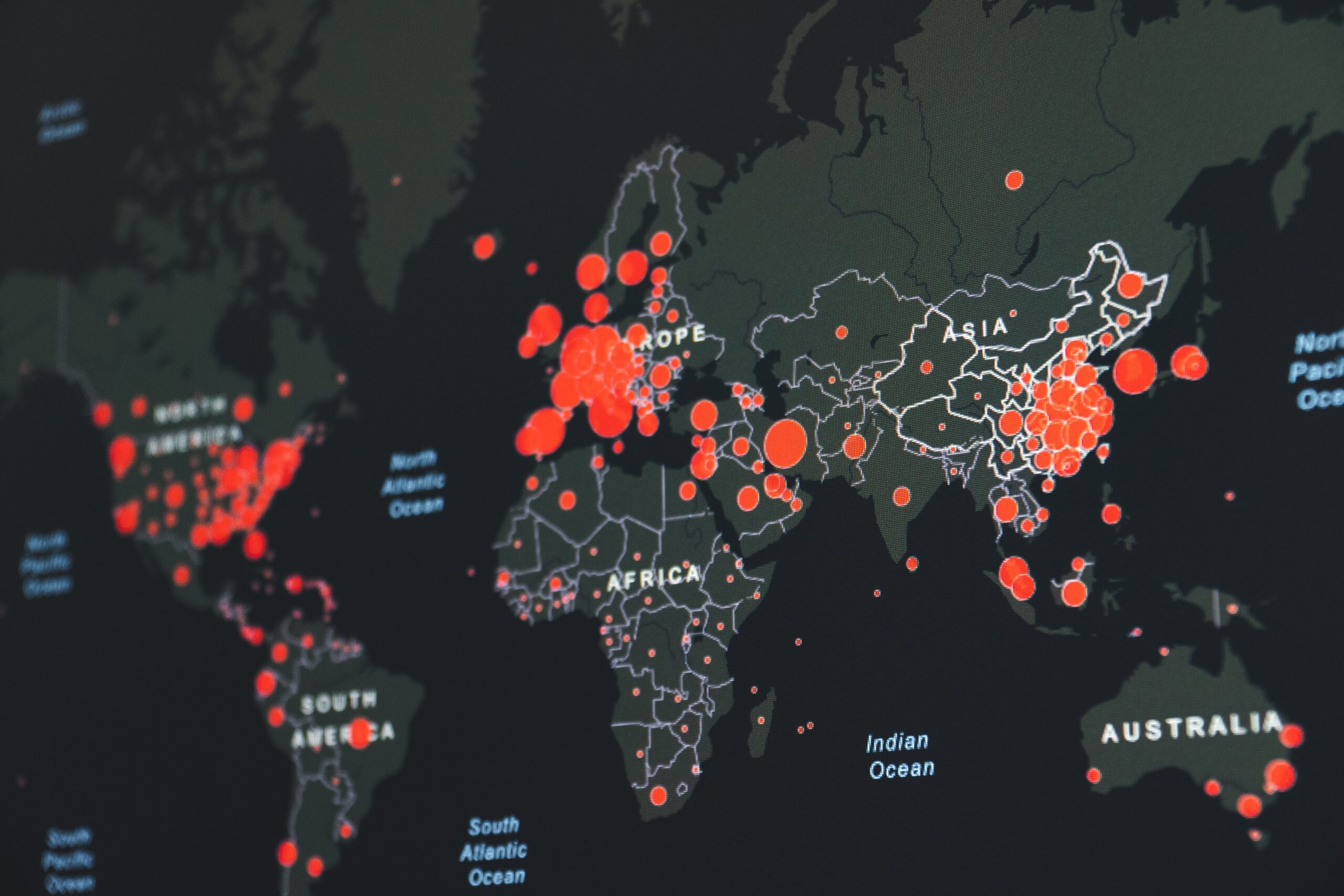
First, I start with web scraping to extract the data from China’s National Health Commission and use Tableau to visualize the outbreak progression spatially. I also created a dashboard where we could easily toggle between the dates and provinces for a closer look.
Disclaimer
Please note that the data I’ve collected is up until February 11. As you read this article, the data may be off the mark and can’t reflect the current situation of this outbreak. I will explain there is an easy way to keep up with the live data later in the article. I used a web scraping tool – Octoparse to extract data instead of coding since it can transmit the data to a feasible format without data cleaning.
Choose a data source
If you google coronavirus data, I’m sure you will find many resources. Sources like Kaggle and WHO are both secondary data collected by others which lag behind the latest data from the primary source like the Chinese official health website. If you are a data analyst who has strict standards regarding accuracy and timeliness, you should avoid drawing conclusions with the secondary data. So what source should you use? Primary data is what you choose. At this point, I chose Coronavirus Update Source as it is saved as JSON, enabling us to stream the data for individual cities to our system through an API pipeline.
Scraping Template
Another way to extract the live data is by using a scraping template as I did from the last article. It’s a cut and dry solution for people who can’t do coding (Watch this video to get details). You can set a task scheduler in order to get up-to-the-minute data.
Data Visualization with Tableau
Once we get a sheer volume of data, we can upload it to Tableau. I first created a map layer by simply dragging the Province/State to the drop fields. After that, I add time-series and accumulate values to give a full look of the data trends over each province. I draw out Hubei province as I can take special care of its data trends. The map shows the historical spread of Coronavirus over the last 20 days since January 22nd. As of February 11th, the number of confirmed infections in Hubei alone hit 33,366.
We can tell that besides Hubei, this outbreak has a large impact on Guangdong, Zhejiang, Hunan and Henan as well.
Note that the reported cases from Hubei are significantly greater than all the others combined. I create a group and divide them into two categories: Hubei and Others. To get a better idea of where this outbreak is leading to, I also added trend lines to analyze the current situation. You will notice that both Hubei and others begin to slide underneath the trendline which indicates a tendency to decline in confirmed cases. However, the death toll doesn’t show a positive change as the numbers are still above the trendline.
The recovery rate among provinces besides Hubei seems to be some cheerful news as the trendline is stiffer over time, and more places move upwards with an indication of inclining in the recovery. Recovery rates will continue to grow as people are now taking prompt action to defeat the virus.
Final thoughts
I made an animation since it is a great way to understand the big picture where we are able to see the progression of this outbreak. Once we visualize the data, it becomes much easier to analyze. The biggest challenge in data analysis is data collection. I usually would invest most of the time on mindless labor work. Often, I also need to repair the data format manually. I found that a web scraping tool can greatly elevate them productively. However, I wouldn’t recommend abusing or scraping any website excessively. This could lead to serious legal consequences.